
Vision is just one of several senses that dogs use to scan their world for important information. Any visual scene has multiple aspects to which dogs’ brains are sensitive: brightness, shape, contrast, and motion are a few of these. But what about color? Many authorities have stated that “dogs are colorblind”, with the implication that dogs perceive only black, white, and shades of grey. In fact, this was not known for certain, but became “folklore”.
In the late 1980s, a definitive set of experiments was done at the University of California by what may well be the world’s foremost research program on comparative color vision. To define canine color vision, each dog was placed into a box facing a display of three round light panels in a horizontal row. Beneath each light panel was a cup. A computer provided combinations of different colored lights in the three panels. Two were always the same color, while the third was different. Over a series of some 4,000 trials, each dog was taught to “find the one that’s different”. Every correct choice was rewarded with a dog treat in the cup beneath the correct choice. Every wrong choice meant that no treat was forthcoming, from any cup. All the test dogs were so dog food driven that they weren’t even starved for the tests. When it was clear that each dog understood the test, some 200-400 tests were run per session, over a period of weeks.
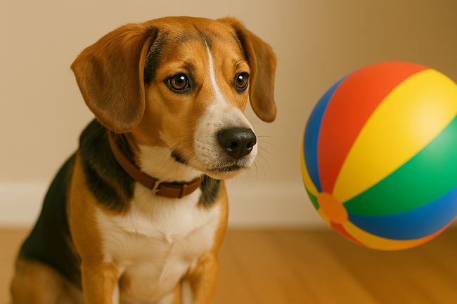
This provided a large data set on which statistics could be run. If the dog couldn’t tell two colors apart and was just guessing, s/he would be right, on average, only 33% of the time (one out of three possible choices). If the dog could tell two colors apart, s/he would be right much more often. To ensure that the dogs were identifying the different panel based on color alone, the position of the different colored panel was randomly moved around (left, middle, or right) and the relative brightness of each light was also randomized. These experiments showed that dogs do see color, but in a more limited range than that seen by normal humans, who see the rainbow of colors described by “VIBGYOR”: Violet, Indigo, Blue, Green, Yellow, Orange, and Red (plus hundreds of variations on these shades). Instead, dogs see “VIBYYYR” (Violet, Indigo, Blue, Yellow, Yellow, Yellow, and Red). The colors Green, Yellow, and Orange all look alike to dogs; but look different from Red and different from the various Blues and Purples. Dogs are very good at telling different shades of VIB apart. Finally, Blue-Green looks White to dogs.
The simple explanation for these differences in color vision is this. The retinas of normal humans have three (3) types of color receptors, called “cones”. Each cone type is particularly sensitive to light of a narrow limit within the entire VIBGYOR range. That means that three different “cone lines” of communication run back to the visual part of the brain, which then compares the weight of the signals coming in from each cone “line”. Different weights produce a perception of different colors. In dogs (and in “green-blind” humans), there are only two (2) types of cones, so there is less basis for comparison by the brain, and thus the perceived color range is more limited. In sum, dog color vision is “color-limited”, not “color-blind”.
How can we put this information to use as dog trainers? First, we must recognize that color is just one aspect of a visual scene as perceived by a dog. There are two other aspects that are just as important, if not more so. The first of these is motion. Think of a green lizard motionless on a leafy branch in the tropics. Both you and your dog would have a hard time seeing it – until it moved. Think back to your dog chasing a green tennis ball against green grass. He can follow it fine, even though there is no color difference on which to cue. Objects moving at a moderate rate of speed are, in general, easier to spot than motionless objects.
The second of these is contrast (that is, outline against background). A stationary object that has a very distinct and very different shape from its background is easier to spot, while one that is patterned like its background will blend in. That’s the principle of the camouflage clothing worn by hunters. Yes, it’s the color of the woods, but more importantly, camo breaks up the human body’s outline against the patchy background scene of branches, leaves, and underbrush. Even small movements are harder to see when an object’s outline blurs with its background.
The third is color. Back to hunters for a moment, ever wonder how we get away with wearing screaming hunter’s orange hats with our camouflage jackets and pants? Deer are probably like dogs (VIBYYYR): to them, orange is not different from the green or brown undergrowth, and a hat doesn’t give a terribly distinctive shape. As a color, safety orange sticks out like a sore thumb to humans, but not to dogs or deer.


To maximize an object’s visibility to a dog, we should strive to combine: (1) moderate motion (when feasible); (2) maximal contrast (a dark and white pattern unlike that of the background scene); and (3) stand-out color (one that is identifiable by dogs and does not occur very often in the background scene). The best of all possible worlds for most background scenes would be boldly patterned Bright Purple and White objects. This is great to keep in mind when choosing the best Dog Toys, especially those intended to teach a dog to fetch. Having said all that, let’s never forget the other keen senses the dog has at his disposal (and we do not): smell and hearing. These are minimally helpful when a dog is working bumpers but play powerful roles when a dog is working live or shot game.
Provided by Dana K. Vaughan, Ph.D., Dept. of Biology, University of Wisconsin.
Related Articles & Free Email Newsletter Sign Up
How Humans Developed a Successful Partnership with Dogs
Proper Dog Training Starts with Building Lesson Plans
Comment here